I recently compiled my major CG works from February ’05 til September ’06 into a neat Excel file, and the amount of change in quality and technique over the period was really astounding.
I began working with CG around Sophomore year (2001), and my first pieces were very simple, colored using fills and Gaussian blurs. I scanned in my line art after inking with a real pen. By the time this most recent “period” began, I had been CG’ing for four years on a very slow learning curve. Despite understanding the basics of color, line, and texture, many elements of my CGs really stuck out as being immature or poorly executed.
Most prominent was probably the needlessly thick lines. Thick lines are only excusable when they are genuine strokes, conveying weight and shadow. I was using thick lines simply because I couldn’t draw the thin ones without having them waver or appear jagged. One of the largest changes in large-eye anime-style drawings over the next year was to whittle away at the line thickness. The lines ended up thinned down by a factor of at least 4 or 5 by the end, if not more.
Indeed, I have recently experimented with dropping lines altogether as I continue to pursue the hybrid anime-realistic style with larger than normal eyes (and especially irises), thinner lips, and narrow noses on roughly normal-proportioned faces and bodies. My early attempts at “realism” still relied a lot on lines, a huge mistake in mentality.
The more subtle change in mentality has been from one of “I’m drawing these 2-D shapes with pre-defined borders” to one of “I’m drawing a 3-D continuous surface with no clear “edge.” As such, I have striven to increase the contrast between light and shadow, which only carry meaning in a 3-D world.
My super-deformed style reached maturity, in the sense that it has stopped significantly changing for several months now, and I remain satisfied with works of this type from earlier on. My basic anime style continues to change, but almost the only factor that is now being tweaked is the shape and coloration of the eyes.
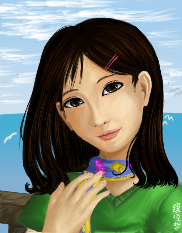
The greatest changes now are taking place in the previously mentioned semi-realistic style. Even work from a month ago is displeasing to me. In essence, the semi-realistic style demands much more stringent adherance to principles of proportionality. The neck mustn’t be too long; the eyes mustn’t be too far apart; the ears mustn’t be too short. I have had to constantly study various photographs in order to adjust my wayward proportions, as well as come to understand lighting and its effects on the contours of the face much more closely.
I am certainly not satisfied with any of these semi-realistic works thus far, including the most recent one that you see above. While at least now I can say, “She looks kind of pretty,” the work is a far cry from maturity.
One of the biggest telltale signs of maturity is the “flip test.” Any mature style work should not look blatantly “wrong” if it is mirrored horizontally. The semi-realistic works tend to fail this test, in the sense that something looks amiss in the mirror image. A lot of times, it is the symmetry being skewed on a 3/4 view portrait.
Every art requires two elements: technical ability and artistic expression. The former without the latter makes for dry, copycat artwork like what I produce right now. The latter without the former is a lousy mess. However, the first almost always has to come first. With violin, I had to learn all the techniques very well so that I could concentrate on the artistry without thinking about what techniques to use. As a friend of mine put it, there’s a point where “you can learn any piece you want to.” That’s the maturity of technical ability, and it allows a person to approach any piece and play around with expression. Music lessons in the later stages are all about expression, not technique.
The same goes for cooking: one needs to know how to bake and fry and peel and dice, and so on, before being prepared to tackle any recipe that uses standard techniques.
And so it is natural that with CG art, the same applies. One needs to know how to emulate textures, render lighting, and reproduce effects before then delving into true artistry. I am not an artist when it comes to CG: my drawings have no emotional or artistic qualities. I am simply trying to hone my skills until I can execute what I envision in my mind. As you can probably tell, I devote almost no time to backgrounds; the poses tend to be very elementary; the colors are literal (ie, what they’d be in real life).
When I feel I am satisfied with my ability to use colors on the computer to the effect I wish them to convey, then I will begin producing real art: works that have some philosophical or personal purpose, in the same way that I use music and writing not for the sake of an exercise but for self-expression. That means that the poses will be carefully selected; the backgrounds will be as lush as necessary; the colors will be affected and impacted by the mood and purpose.
Until I can achieve that, I am no artist. I am merely a person making marks with my tablet.
Leave a Reply