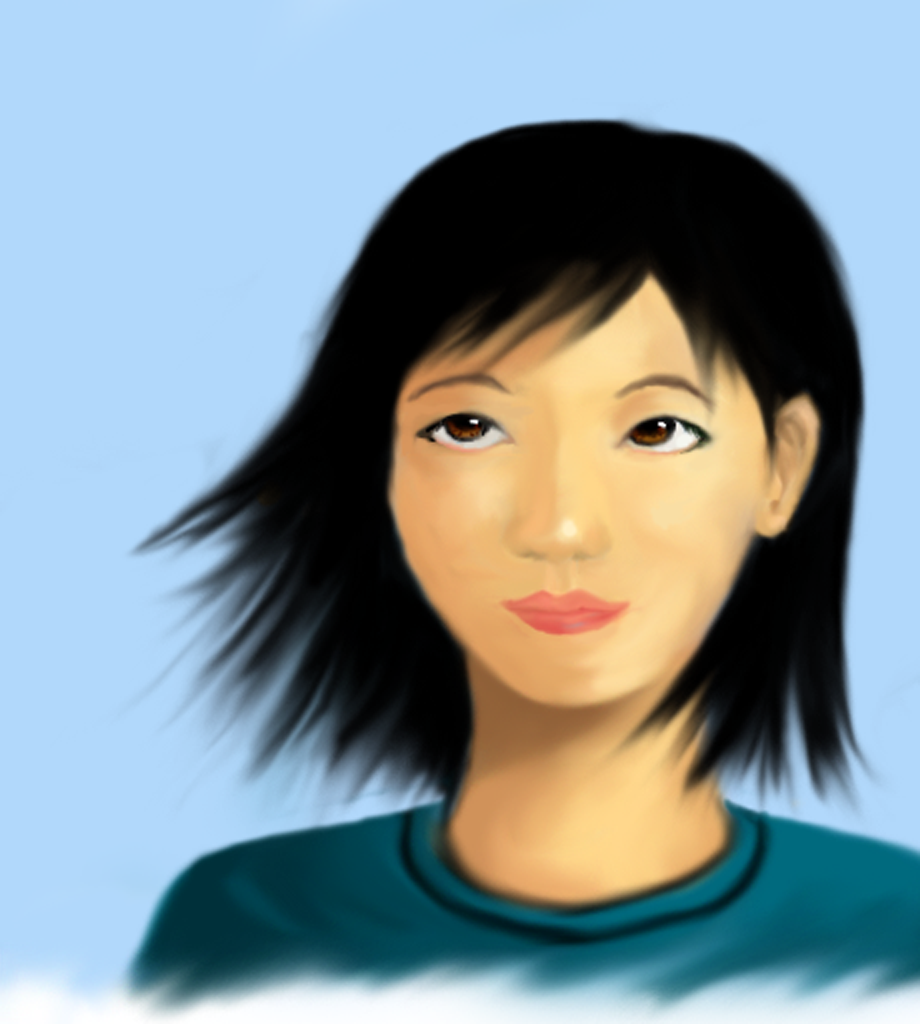
Today, I decided to draw again, but to take a break from anime-style coloring. I instead wanted to explore the style I’ve seen primarily used in Chinese cartoons, which keeps mostly normal proportions but idealizes hair and features. I think this simple face improves a lot over my previous attempts at keeping realistic proportions. Well, there’s still a long ways to go, but maybe if I practice a lot, I’ll get the hang of it. The shading on the left side of her face is messed up (if you look at it from an angle, or darken it, you’ll see what I mean). And the shading on her hair is … non-existent. And the eye asymmetry remains, despite probably an hour’s worth of effort in drawing and redrawing and redrawing and redrawing yet again. Seriously, those ugly eyes took a lot of work!

This is actual size. You can see an enlarged one here, I guess.
As always, not drawn from reference, although I did look in the mirror for the eyes and study shading techniques from a couple of my favorite artists.
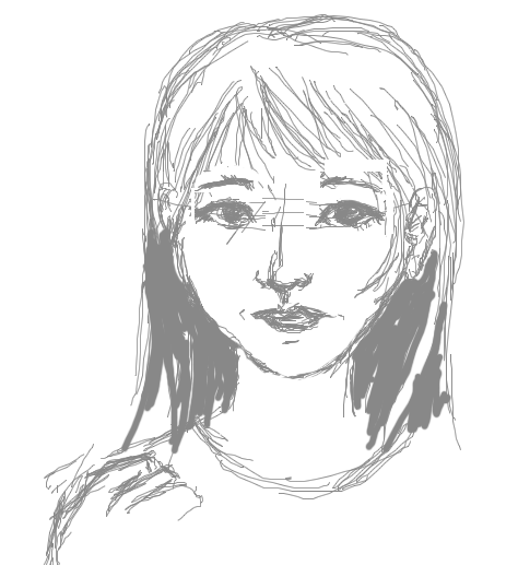
The sketch, which looks nothing like the final (I made a ton of changes from the sketch):
C says:
hmmm, I really like the non-existent shading on the hair… I think that idealized Chinese hair is a mass of black, so dark that there shouldn’t be any shadow and that in the past, idealized hair isn’t about luster or shine but about the denseness. Anyway, the hair is my favorite part of the painting. I really like the eyes next. ^__^ I would love to see more shading on the face though… it looks really flat right now? It’s very hard to identify the cheek area shading… but I really like this one as well as the sketch! They are definitely two very different things!
June 13, 2008, 10:59 pm