Colors are like keys in music – they carry with them character, personality, and of course, personal friendships with other colors. They can really define an object, a space, and even an emotion. I find some hues much more beautiful than others, and I wanted to talk about them here.
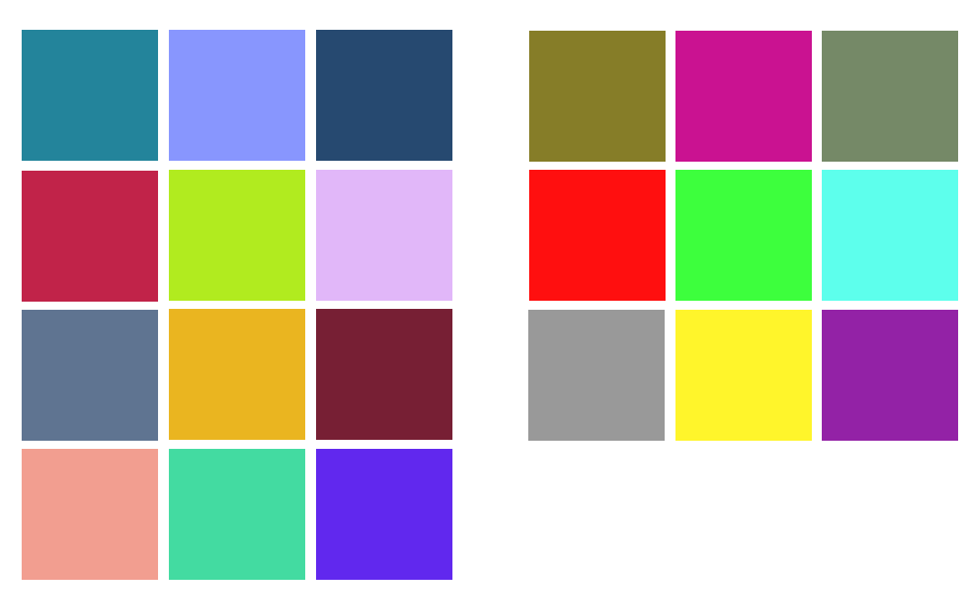
Figure: I’m describing the colors from left to right, top to bottom.
My favorite colors, in no particular order:
Turquoise (of a more teal-like shade) — My particular take on turquoise is a beautiful, moving shade of blue-green that is toned down with a hint of white. I know there is a rock called turquoise, but that is a different color than I am addressing here. This color conveys a certain wisdom, a populist take on preciousness. It stands out while never taking itself too seriously. Good for jewelry, site layouts, roofs, and uniforms. Matches very well with white and black, also going well with silver, lighter and darker shades of blue-green, and somewhat compatible with gold and burgundy, although turquoise does not like to be in competition with other powerful colors.
Periwinkle — A downy, gentle blue-lavender that captures the essence of dreams, fluffiness, and childhood blankets. It has a powdery feel to it, almost like fairy-dust. While it is light, it conveys warmth and thoroughness. Best used in bedsheets, curtains, packagings. Matches well with off-white but also with other shades of blue and violet, as well as light grass greens.
Light Indigo — This watered-down form of blue-side indigo has a faded quality to it. It is proud and has heritage, but is not brilliant or spotlight-getting. I think it is a wonderful color for t-shirts and cars, and possibly the sexiest color of jeans as well (on guys and gals alike). It is tough but has a certain feminine mystique to it as well. Goes well with gold, silver, gray, white, and deep reds.
Bright raspberry — A cutesy color with substance. It is brash like youthful lipstick, but also mature and independent. It stands out and makes a statement without being subservient. A nice color for logos and elegant invitations, as well as for cloth napkins and girls’ summer tops. Goes best with gold, but also matches lighter shades of pink, darker red-variants, platinum, black, and occasionally (but prudently) shades of green.
Chartreuse — The color of faded landscapes, bleached by direct sunlight.
Lavender — The color of dreamy wildflower landscapes and faraway mountains.
Slate blue/steel blue — A quiet, humble color that graces stone paths, traditional roofs, and overcast skies.
Goldenrod — The solid-color projection of gold, this orange-infused yellow is much more refined and well-mannered than all other colors in its vicinity. It has the magical ability of matching just about any other beautiful color, owing to its neutrality and metallic origin.
Violet-burgundy — The color of red wine and evening gowns, I can hardly think of a more adult romantic-styled color.
Salmon — A slightly orange shade of lighter pink, this color is creamy and wistful without being outright girly. It is a good color for leisurely clothes and towels, as well as the trim on dresses or ribbons. It also a good color for the fish ..
Aquamarine — The rock itself has many different possible shades. On the net, aquamarine refers to this more greenish hue that is like a traffic light when it’s off but illuminated by sunlight. It is a tender relative of sea-foam green, the ubiquitous yet seemingly mis-named crayon and marker color.
Royal Blue — It’s really a type of purple, but it sounds nice calling it blue. A nice stand-alone color that holds its own as a solid, it is one of those rare colors that fuses many traditions into one. It is a nice color for tunics, blouses,
Leave a Reply